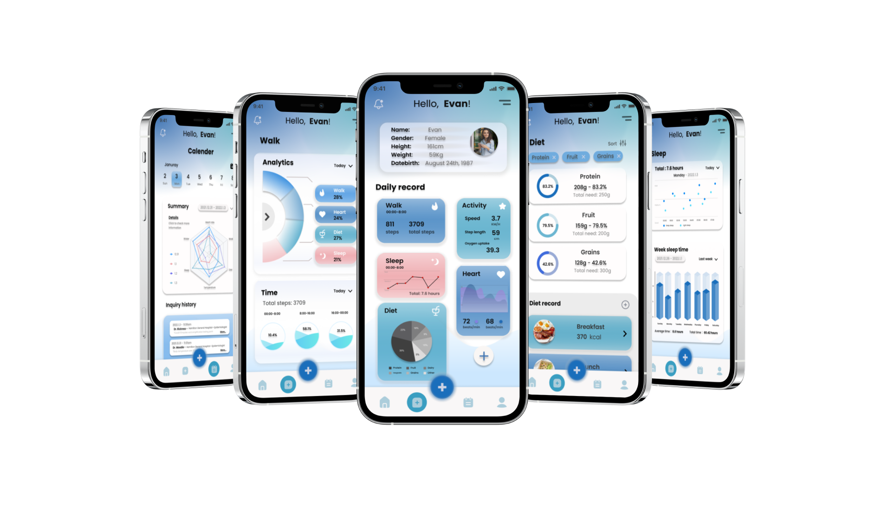


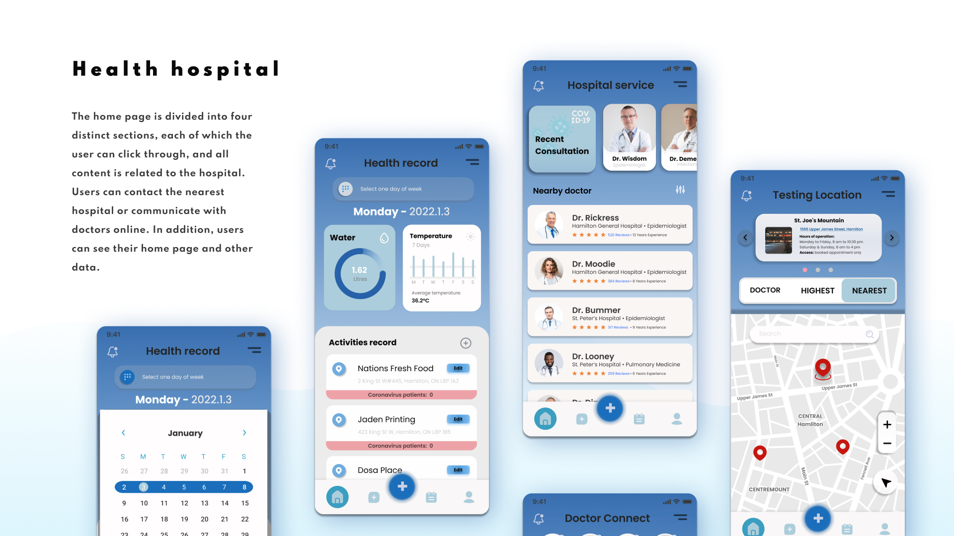
DoctoC is for users who need to know about their personal health, are increasingly worried about their bodies due to the impact of Covid-19, and are afraid of going to and from the hospital. At the same time, everyone needs to know if they are infected with the virus. Therefore, perfect health monitoring is possible for each user.

In the design process, it is necessary to make the use of the app simple and clear, and it requires very sufficient data analysis. There needs to be a balance between manipulating simple and complex data, so it is necessary to try it repeatedly during the design process, and to understand the design that users need most through usability tests.

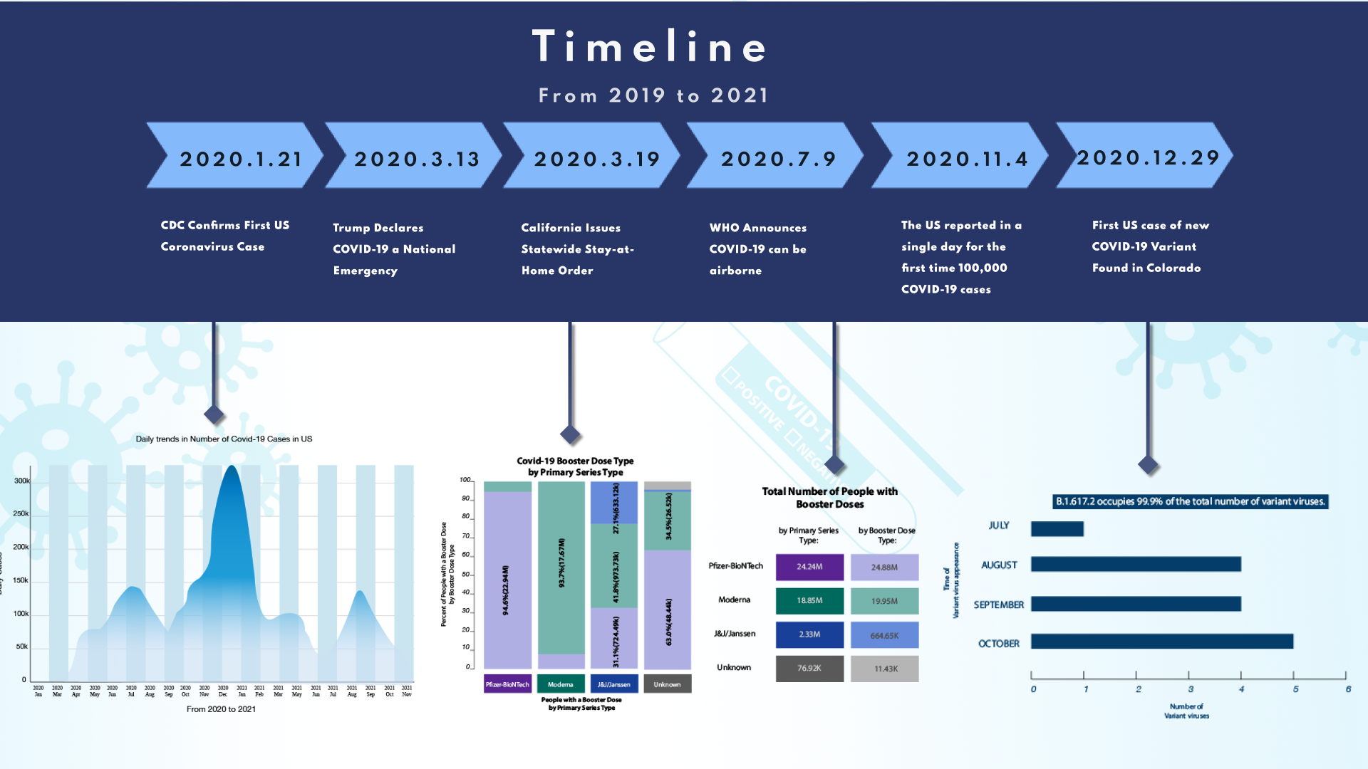
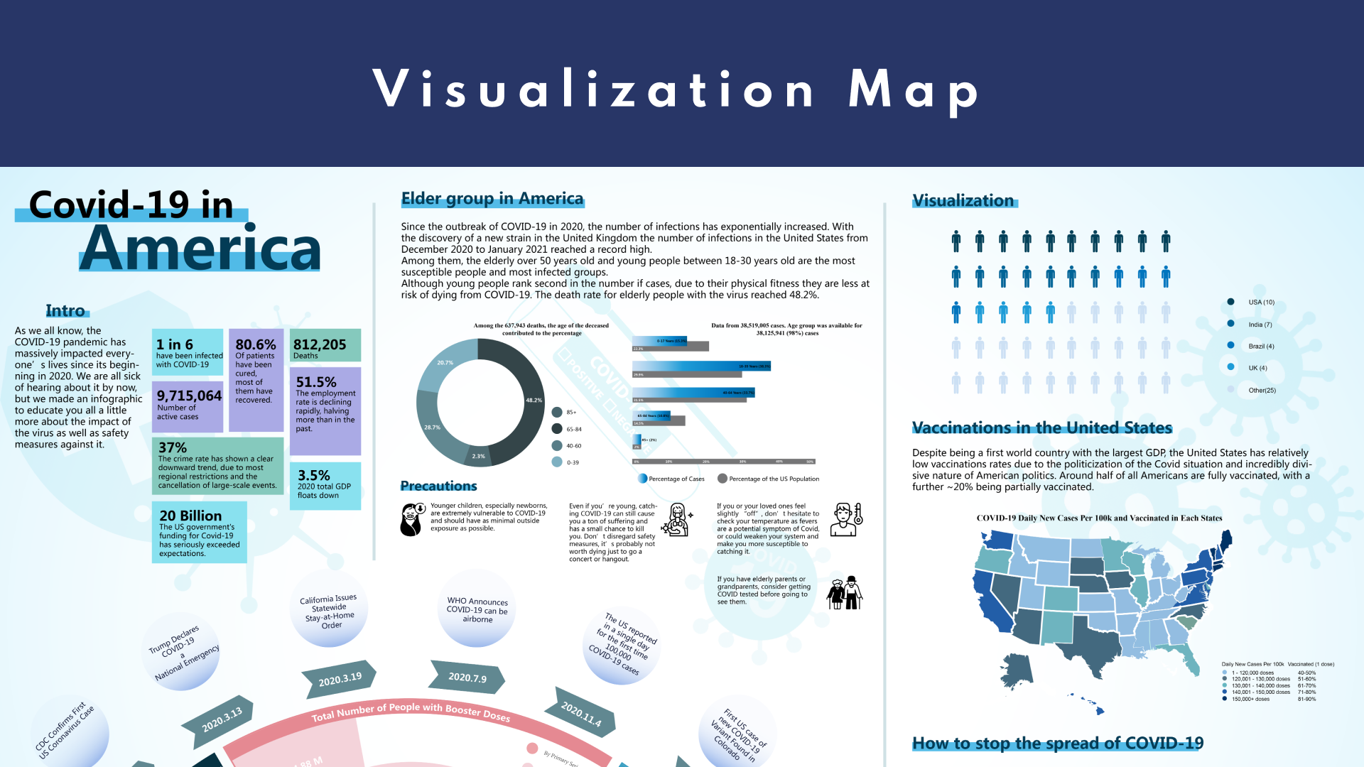
At the beginning of the design, I first tried to make a visualization map as the first learning, and to understand the specific situation of "Covid-19". Through practice and data management learning, you can avoid monotony of data and organize pages reasonably when designing an app.
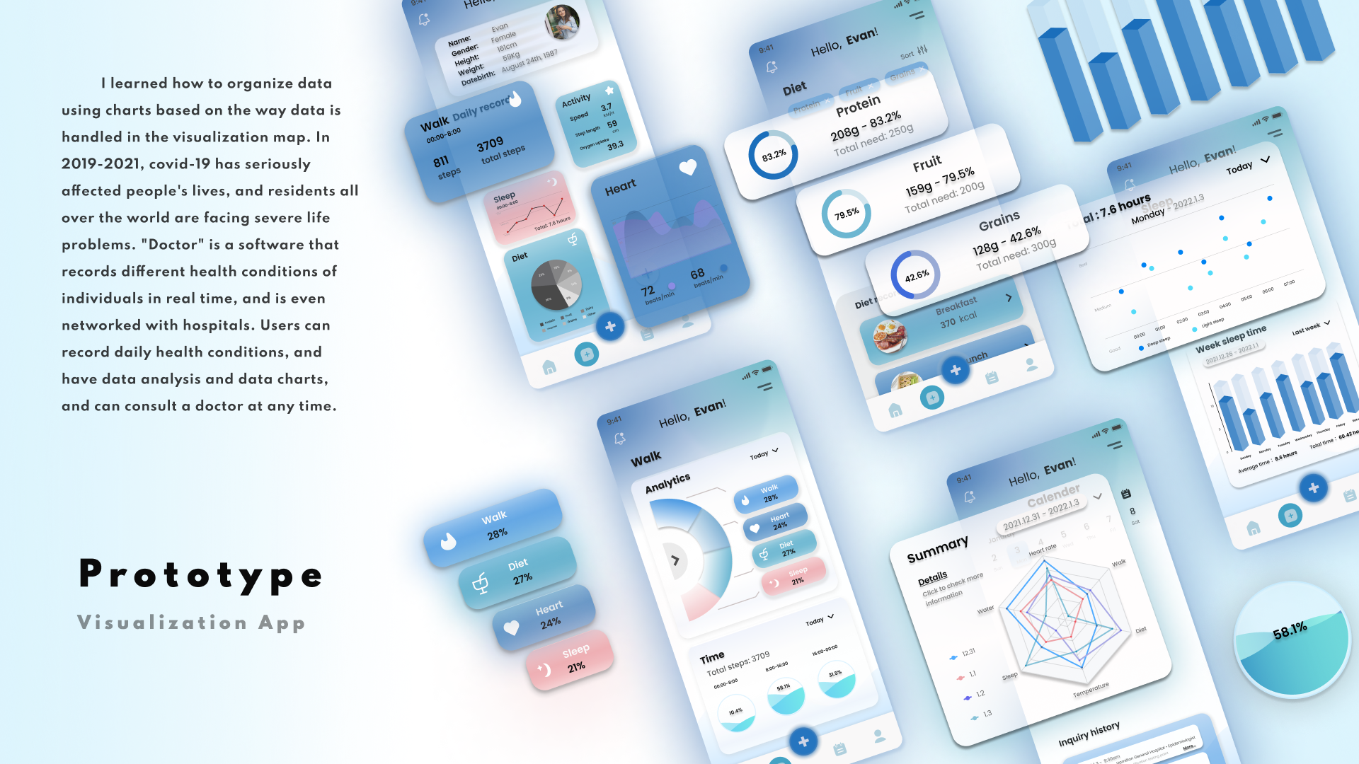
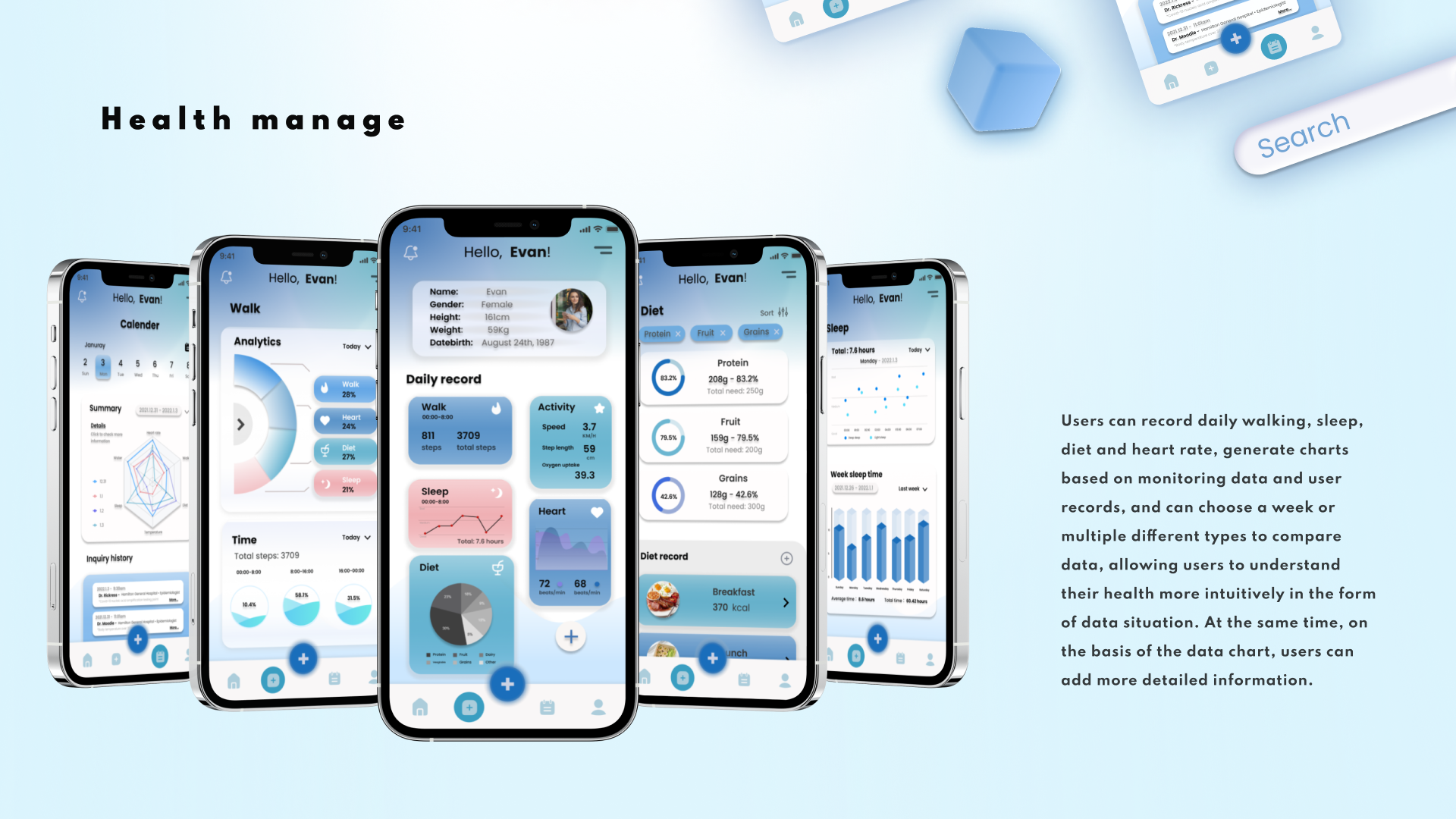
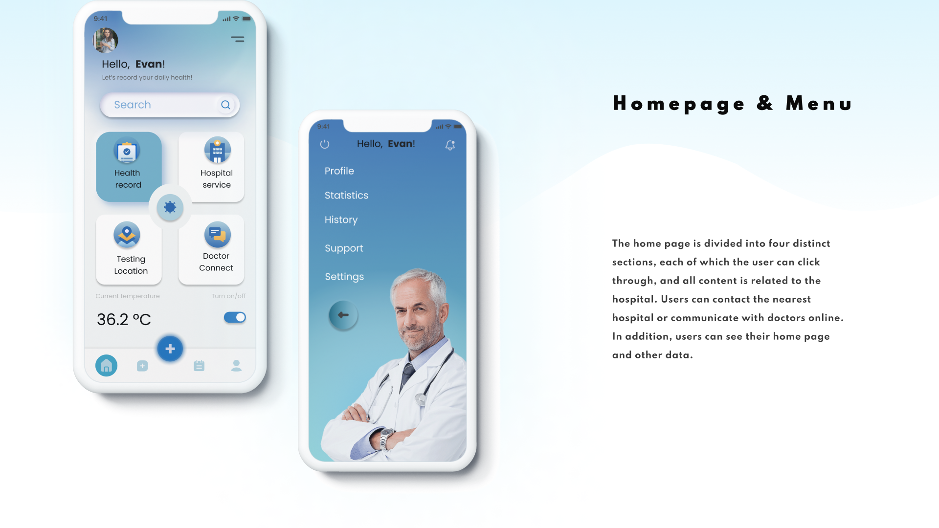


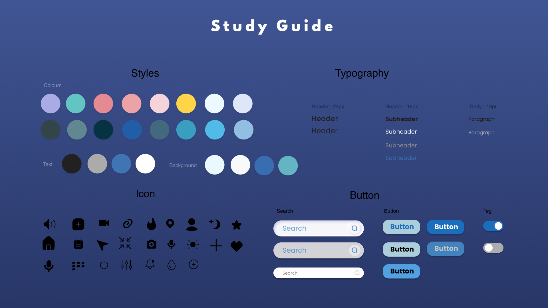
This is a group project (Visualization data only) and we collect different types of data depending on the time and question. Second, we collated this data and used different types of charts and determined styles, layouts, colors, fonts. Finally, it is roughly divided into 5 parts according to the data.
Panelists: Lufengdan Bai, Bowen Lai, Russell Hsuing, Ziheng Tang




In the user's future life, DoctoC can more conveniently help the user to provide health status assistance. We hope that Covid-19 can no longer affect the lives of every user, and that through the app can pay more attention to personal health.